
A Clearer Path to Treatment
Redesigned the top-of-funnel, medical intake, treatment results, and checkout user experiences for the Sexual Health category at Hims & Hers.
00

problem
As Hims & Hers was changing and expanding, so was their creative branding. The Sexual Health category was falling behind visually and was not cohesive with other category experiences. Users came to us expecting a tailored and personalized experience accessing treatment, but felt unseen when it came to finding a treatment that matched their concerns.
As Hims & Hers was changing and expanding, so was their creative branding. The Sexual Health category was falling behind visually and was not cohesive with other category experiences. Users came to us expecting a tailored and personalized experience accessing treatment, but felt unseen when it came to finding a treatment that matched their concerns.
solution
Chose not to reinvent the wheel and instead leverage other category components to keep engineering time as fast as possible. Also decided to introduce animations at key moments, for example, loading transitions, to allow the user to pause before receiving their treatment result.
Chose not to reinvent the wheel and instead leverage other category components to keep engineering time as fast as possible. Also decided to introduce animations at key moments, for example, loading transitions, to allow the user to pause before receiving their treatment result.
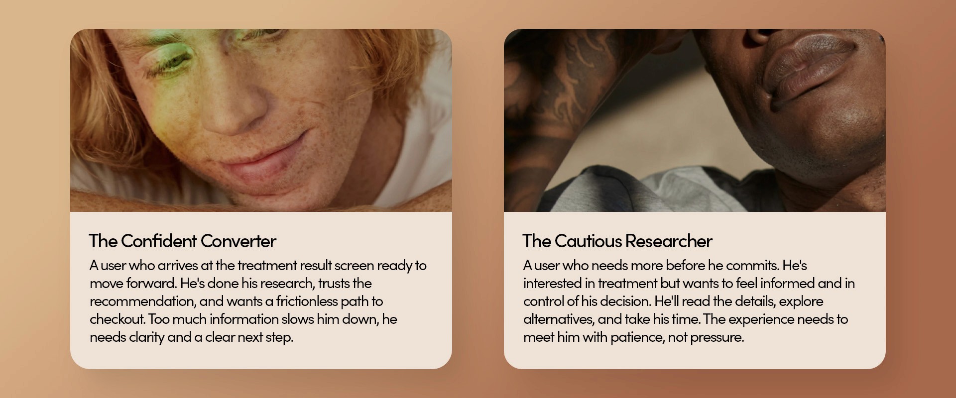
Three thousand users a day were moving through a Sexual Health experience that no longer reflected who Hims & Hers had become. I owned the full acquisition flow redesign, medical intake through checkout, with one goal: make users feel seen at every step.
We knew we had two types of users:
Designing Within Constraints
Working under tight timelines is a constant in this work, and this project was no different. With limited engineering resources, there was no room to rethink or reinvent from scratch. Instead, I leveraged existing components and code as a foundation, personalizing and tailoring the experience to the needs of the ED customer.
01
Information Gathering
Aligned with PMs, marketers, and copywriters on project scope
02
UX Ideation
Competitive research and low-fildelity prototyping and wireframing
03
Visual & Content
End-to-end collaboration with copywriters and marketing, stakeholder alignment and feedback integration, and design handoff to engineering
04
Delivery
Finalize design specs and design audit on UAT build
Redesigning the Most Important Screen in the Flow
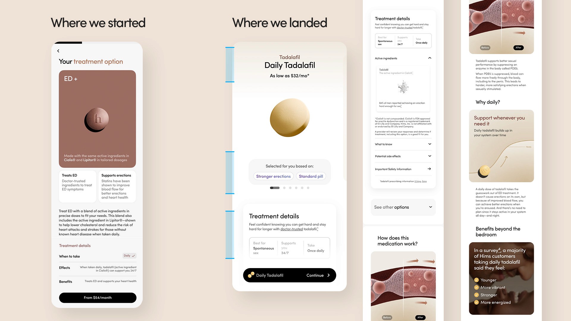
The treatment result screen was the most critical touchpoint in the flow, it's where the user sees their recommended treatment for the first time. The existing design didn't reflect that weight: visually outdated and lacking warmth, it failed to meet users at what is, for many, a significant personal moment. The design challenge was balancing legal constraints with the need to give users enough information to feel confident in their treatment. We solved for both by redesigning above-the-fold as a hero-centered layout, establishing trust and clarity at first glance, while creating a visual hierarchy that guided users through the details they needed to move forward.
Bridging the Gap Between Intake and Treatment
The treatment name and price were moved higher up, freeing up space to add a playback of the user's intake responses. We noticed that users didn't understand why a particular treatment was being recommended to them. The playback allowed us to bridge the gap between their responses and how those answers determined their result. Legal pushed back on this approach, but we were ultimately able to find a middle ground. As users scroll down the page, more details and information are revealed progressively. The dropdowns allowed both user groups to shape their own journey and interact with the screen on their own terms.

Delivered in a month under tight engineering constraints, the redesign also modernized the codebase, a quiet but significant unlock that opened the door to cross-category A/B testing and a faster iteration cycle going forward.
Three thousand users a day were moving through a Sexual Health experience that no longer reflected who Hims & Hers had become. I owned the full acquisition flow redesign, medical intake through checkout, with one goal: make users feel seen at every step.
We knew we had two types of users:
Designing Within Constraints
Working under tight timelines is a constant in this work, and this project was no different. With limited engineering resources, there was no room to rethink or reinvent from scratch. Instead, I leveraged existing components and code as a foundation, personalizing and tailoring the experience to the needs of the ED customer.
01
Information Gathering
Aligned with PMs, marketers, and copywriters on project scope
02
UX Ideation
Competitive research and low-fildelity prototyping and wireframing
03
Visual & Content
End-to-end collaboration with copywriters and marketing, stakeholder alignment and feedback integration, and design handoff to engineering
04
Delivery
Finalize design specs and design audit on UAT build
Redesigning the Most Important Screen in the Flow
The treatment result screen was the most critical touchpoint in the flow, it's where the user sees their recommended treatment for the first time. The existing design didn't reflect that weight: visually outdated and lacking warmth, it failed to meet users at what is, for many, a significant personal moment. The design challenge was balancing legal constraints with the need to give users enough information to feel confident in their treatment. We solved for both by redesigning above-the-fold as a hero-centered layout, establishing trust and clarity at first glance, while creating a visual hierarchy that guided users through the details they needed to move forward.
Bridging the Gap Between Intake and Treatment
The treatment name and price were moved higher up, freeing up space to add a playback of the user's intake responses. We noticed that users didn't understand why a particular treatment was being recommended to them. The playback allowed us to bridge the gap between their responses and how those answers determined their result. Legal pushed back on this approach, but we were ultimately able to find a middle ground. As users scroll down the page, more details and information are revealed progressively. The dropdowns allowed both user groups to shape their own journey and interact with the screen on their own terms.
Delivered in a month under tight engineering constraints, the redesign also modernized the codebase, a quiet but significant unlock that opened the door to cross-category A/B testing and a faster iteration cycle going forward.
year
2024
timeframe
1 month
tools
Figma
category
UI/UX
"No matter how many requests are flying in or how quickly things are moving, Gia is unflappable. Her even-keeled approach brings a steadiness to the team that's rare and incredibly valuable."
Hannah B., Hims & Hers, Senior Marketing Manager


